Though he dreamed of studying design, he graduated from Georgetown law school - working from inherent good taste rather than formal training, has achieved something quite rare in the world of interior decorating - a signature look.
The Look pairs extravagant with affordable, perfect with imperfect. Polished surfaces play against pitted wooden artifacts. Antiques converse with bold modern art. Creamy white walls rise above coffee-dark floors. Deliberate symmetry is jolted by a bit of appealing disarray.


 His new book The New Traditional is out since August and its self - help guide to create your own personal interior.
Elements of his look - paint, floors, rugs, lighting,art .Check what he says about them.
 Paint-Almost every wall is Moonlight White in flat finish, paired with Simply White trim in satin finish, both from Benjamin Moore. The sole dip into color is the Woodlawn Blue in the breakfast room, a perfect pale backdrop for his black-and-white photos and well-edited collection of white ironstone platters, pitchers and cake stands. ( In Brisbane I have a supplier who can mix Benjamin Moore colours)
 Rugs-A favorite trick is to layer old patterned rugs on top of a slightly larger sisal carpet. The neutral textured material frames the older rug and sets it off. He likes sisal (which he prefers to sea grass) in a tight, flat weave in a pale wheat color with a half-inch binding in the same shade.
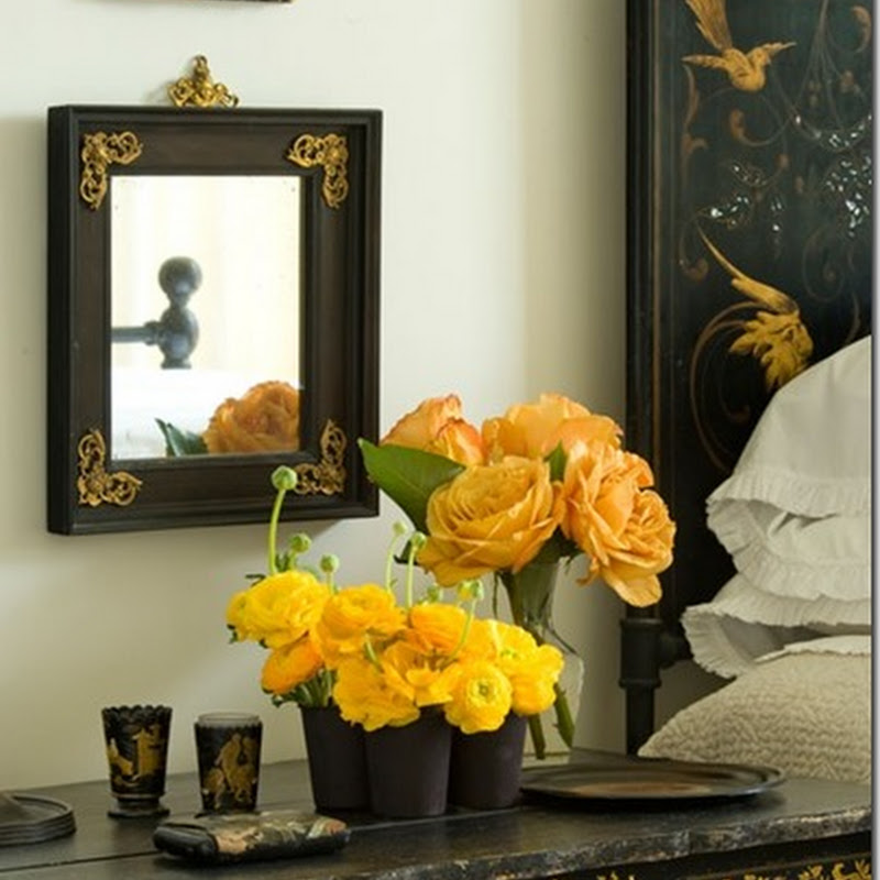
Display-In the master bath, towels are folded in an antique barrister's cabinet with glass doors. White towels only; they don't take up any visual space, says Carter. Art-Don't put up "dumb art." Much better to frame photos of something you care about: your kids or your dog. He hunts estate sales and antiques shops for classical plaster frames, preferably with a bit of chipped gilding, which can be turned into mirrors.
 Lighting-Carter forages through antiques shops and flea markets looking for old vases, former carriage lanterns and architectural salvage to turn into lamps. Some pieces are given an acid bath to create a weathered finish. Check out a line he designed for Urban Electric Co.
 Art-Don't put up "dumb art." Much better to frame photos of something you care about: your kids or your dog. He hunts estate sales and antiques shops for classical plaster frames, preferably with a bit of chipped gilding, which can be turned into mirrors.
 Lighting-Carter forages through antiques shops and flea markets looking for old vases, former carriage lanterns and architectural salvage to turn into lamps. Some pieces are given an acid bath to create a weathered finish. Check out a line he designed for Urban Electric Co.
 Sources Sources















16 comments:
Hi VT,
U right!!! while browsing, I found out that his designs are jst so simple that make things so nice & elegant, calm & sober. Hmmm... what else can i utter.
PERFECT!
I keep my fingers x that storm pass by somewhere in the middle of nowhere. So no disaster happen.
Come over to play at my site. Jst simple rules. No hassle...
classic, stylish & elegant! love his use of dark wood against cream fabrics, love the antique mirror & desk too! simply beautiful
the weirdest thing.......
i am a designer for over 25 years,
and because of the hedeous state of the ecomomy in the US
i have taken a position as thomasville showroom manager - boca raton, florida store.
his stuff really is great.
i did not know all that much about him. thanks for the info...........
ps
your blog is beautiful.
i am using your picture of the horse on the hill with the bamboo picnic set as my screen saver on my desk top.
Very inspiring pictures. A friend of my sister's used Carter for her home, which was published in some magazine or another (I think the second to last picture on this post is her home).
Do you know why he prefers sisal to seagrass? Timely question, as I am doing a casual area rug in my dining room to counterbalance the very formal chippendale chairs, table, and hutch I inherited. I have a sisal in the front hall, and was probably going to get a sisal for the dining room too. Great tip on the size of the border that Carter prefers. My rug guy was trying to convince me to do 3", which seems SO wrong!
I love Darryl Carter's work. His interiors are so serene.
I purchased his book last week. It is a permanent fixture on my desk. I just flip through it whenever I have a spare minute.
xo
Brooke
I haven't seen this book but it looks like it should be added to my wish list. I love all of these rooms and the huge dining tables are great. I have a white jug fetish so the photo of the shelf with the white crockery appealed too!
Clare
He has great style - very masculine - and the black & whites always work so well together. Thanks for sharing.
allways great inspiration .
. how come your were not on my list !? now it's done ..
Darryl Carter is my favourite designer! I will be getting his book- his interiors are so appealing- calm yet warm- beautiful!
Beautiful images, what a lovely book! I love his rooms and the neutral tones. Amanda x
I have this book also - another great resource for the design library! Love the pics you chose - gorgeous! Tracey x
I just bought his book last week but haven't had a chance to even open it up! I think that will have to change to night after seeing these beautiful photos.
Inspiring images ... such a serene style. I love it! A-M xx
très belles photos, j'aime beaucoup les grandes tables campagnardes.
Thanks for introducing me to the very talented Darryl. I loved his comment about dumb vs meaningful art - now there's a man with soul despite his legal background!
Millie ^_^
Hi Viera,
Lots of great ideas on what we can do in our home... thanks! :-) I love the two large photos of the dog on the wall, and the bathroom with the white bathtub and dark wooden shelves.
It also seems I have plenty to learn from you when it comes to blogging. How did you add multiple songs? Great idea!
And regarding next year's trip. I do think we'll make it to Australia... unless, that is, you and Miro want to meet us in Hawaii for a week or two. ;-)
Hugs from Holland,
Liz & Family
Post a Comment